Information Architecture
WEB & DESKTOP / DESIGN OPS
LEAD DESIGNER, TEAM LEAD
PLAYSTATION
Abstract
The design tool was not created with a scalable architecture and therefore as more designs and folders were added over time the more unusable it became. In a customer satisfcation survey conducted in our SF and Tokyo office, information architecture was the biggest pain point as designs were difficult to find and there were no standards around organization.
Role & Objectives
- Lead designer and team lead of a design team whose workload I managed
- Led the strategy of how to map the information architecture across the tool for all projects, including for console, mobile, and web
- Led the research strategy that was was conducted monthly by myself and other designers on my team with my guidance
- Met with end-users and stakeholders from all orgs and roles in the US and Tokyo to ensure we were creating a universal solution for all users and workflows
EARLY LEARNINGS LED TO A UX INITIATIVE TO STUDY CROSS-ORG OPERATIONAL CHALLENGES
- Early user interviews and field studies showed that the previous generation tool did not meet neither user or organizational needs to effectively communicate
- The complexity of how information was so disorganized and the lack of standards led users to avoid using the tool altogether
- Users naturally created "hacks" to use the tool in ways that were never originally intended (ie. creating the same project folder in multiple places and pointing URLs to each other)
- Files that were older than a few years were often considered "lost" and users either spoke to a tenured employee to find them or they resorted to re-creating those designs from scratch
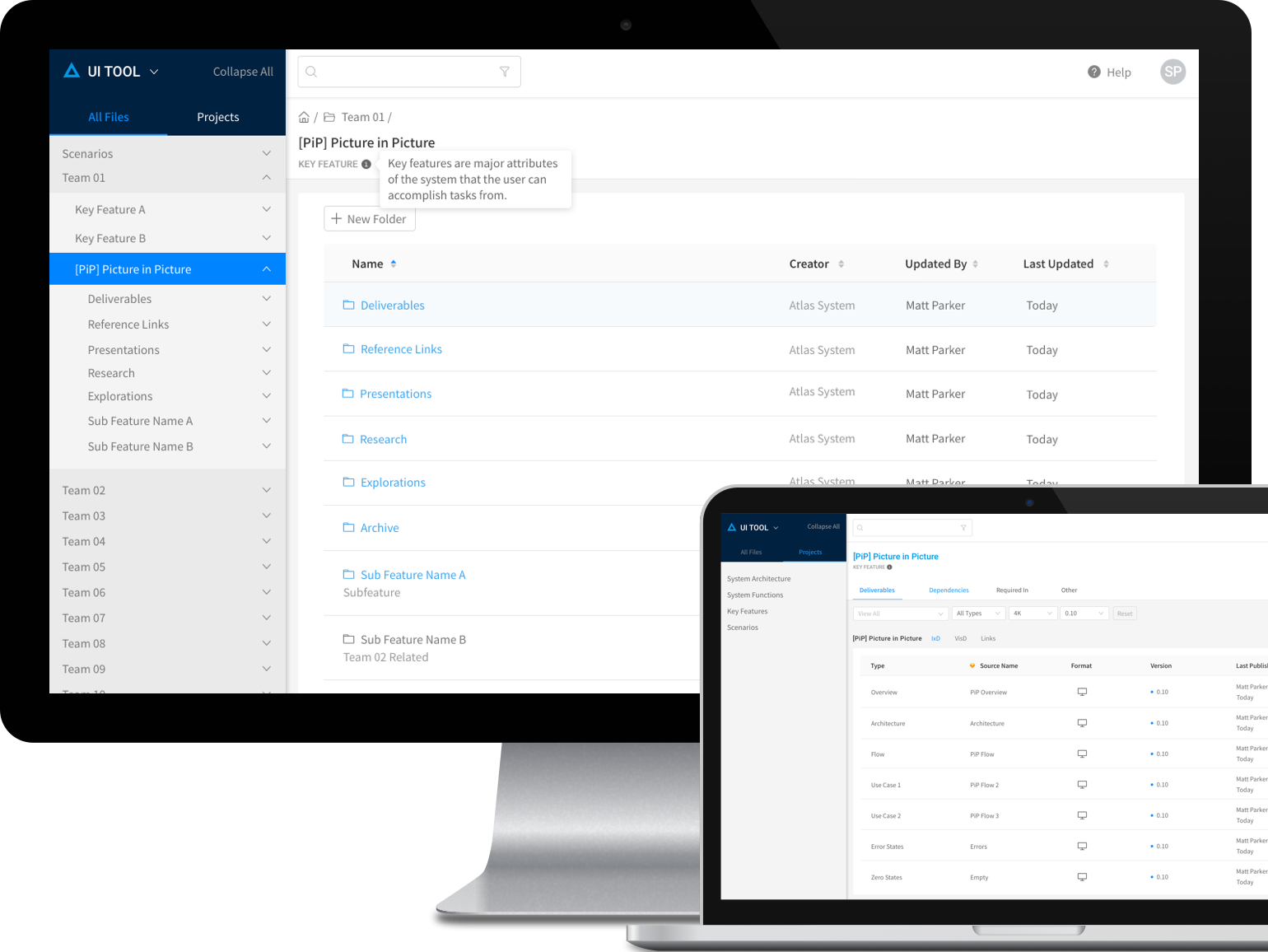
Applying Improvements to Existing Architecture
Standardizing the current tree structure allowed for easier findability and a shared expectation
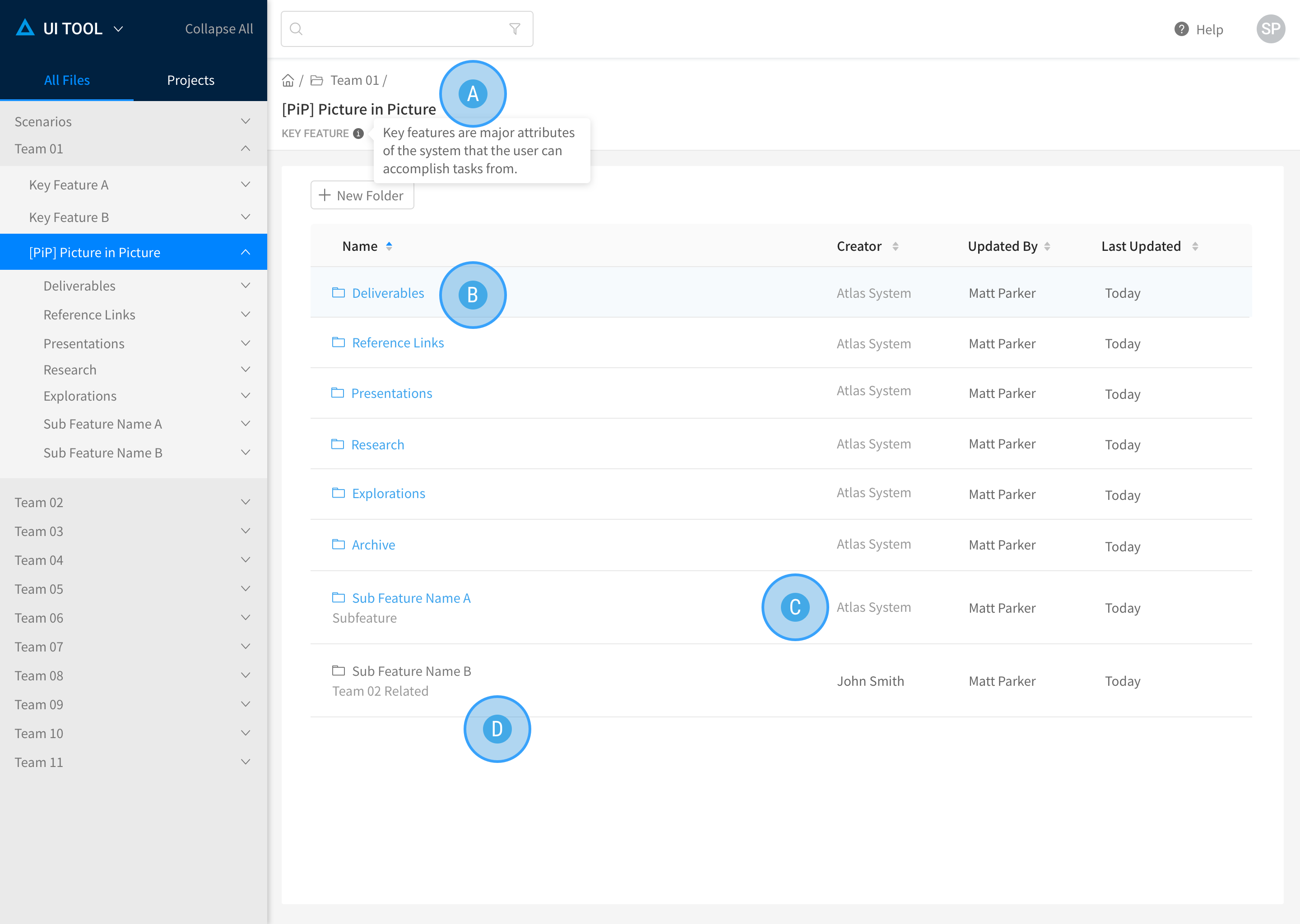
- Official Name and Category Definition: This keeps everyone aligned on what terminology to use and what certain acronyms mean
- System-owned Smart Folders: This is a standardized set of folders that are required in each project and the user cannot modify
- Audited Folder: Once a user-created folder had gone through an audit, it becomes owned by the system and only approved owners of that feature would have write-access.
- Non-audited Folder: This shows a folder that has not been audited yet and therefore still can be edited by anyone.
Users said that terminology was often misused or not standardized, causing confusion and misinterpretations. They also wanted a standardized folder structure across the system, as everyone created their own and findability became a major pain point.
Transitioning to a New Architecture
A faceted model allowed users to see the same information from different viewpoints
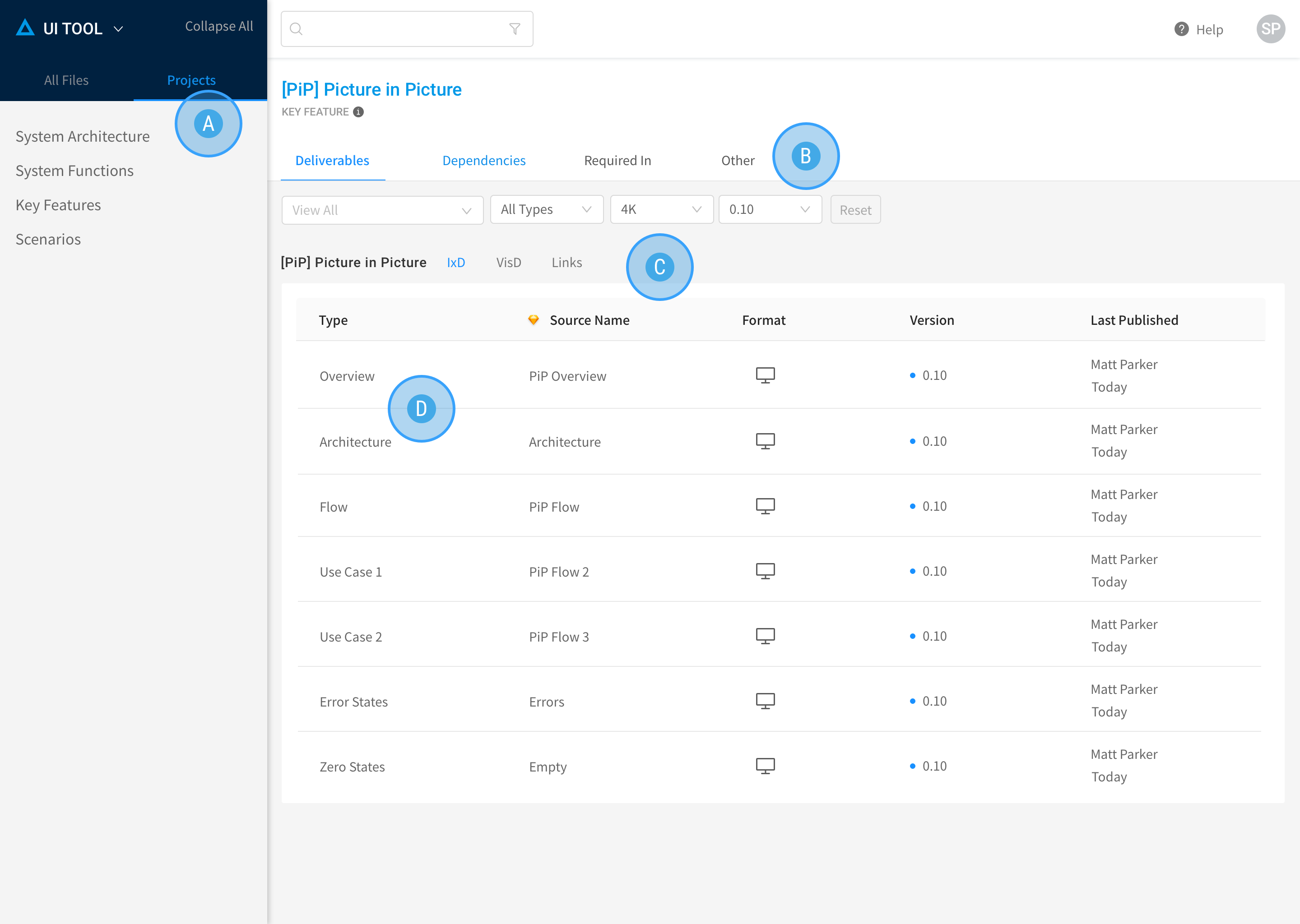
The lack of standards led to user-created disorganization in the tool. These enforced standards and filter mechanisms helped to eliminiate confusion.
- Non-tree Navigation: The current tree navigation was not only cumbersome to click through, it became impossible to know which folder to look into. By categorizing all features into 4 main buckets that were uncovered via research, the navigation experience was not tied to an ever-growing tree menu
- Deliverables, Dependencies, Required In: These 4 sections show all the files, links, and feature relationships. This made it easy to find what you needed, based on whether you are working on a deliverable or a project related to this one
- Deliverables sub-section: Engineers told us they worked on IxD and VisD specs separately and needed this to organize the two into their own sections. The filters above also helped to narrow down files based on form factor and release version.
- Deliverable type: Designers often named their Sketch pages without any naming convention. These standardized categories help to define exactly what kind of spec a file is without having to make sense of the actual page name.
Improved Navigation and Standardized Architecture
In order to not disturb production workflows, we had to maintain both new and old navigation structures
OUTCOMES
- From our research, we realized that users either worked on projects that were dependencies for other projects or that relied on a project that they needed to refer to often
- Having "Dependencies" and "Required In" sections helped to keep users from both ends of the workflow in sync without having to "dig" through a tree menu
- This new structure received positive feedback from stakeholders and executive leadership.
